
Type is one of the most important pieces of a design. The basic building, is here where your potential client will read about your business and reach you. But are you using it right? Or your designer is using it, right? Well, let’s learn a little more about the difference and how important it is, ready?
There are 3 principles for typefaces, and are really easy to identify but be very careful, or instead of a nice design, you will confuse your potential client.
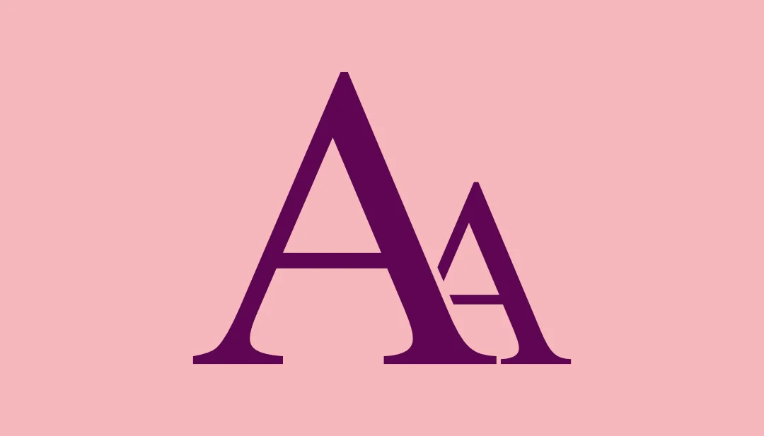
1- Concordance: This one is when is used in design all fonts from the same family, like Arial font, you can use some words in bold, italic, etc… But it will be the same font family, so for this principle make sure you are picking a superfamily type, so you can have multiple variations. Concordance is the easiest one to do, but don’t mean that your design is poor, if you choose a good font and know how to turn it interesting to the client’s eyes there’s no way to go wrong with the concordance. Let’s see an example?
I used here the Roboto Slab type, it’s simple right? Looks like a lot of different fonts but it’s just a big family 🙂
2- Conflicting: This one is the hard and most difficult to get right. Conflicting is when we use 2 or more fonts that are very alike but have some particularities, but, like the name says is very trick, so pay extra attention to these elements:
- Avoid using the same size for both fonts
- Use colors
- Try to use similar fonts with a BIG difference between them
- Avoid using more than 2 fonts
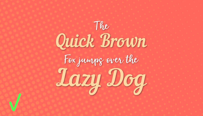
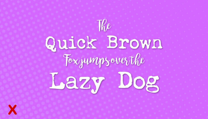
Let’s see a WRONG use of conflicting typeface:
Note how mixed this is, I used 2 similar script fonts (Nautical and Lobster), all in the same size. So, we know that is something wrong, but what it is? Well, this is what your audience will be puzzled by. And of course, we do not want this 🙂
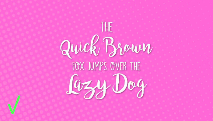
Let’s see the RIGHT example now:
In this example, we have two (very different) script fonts, BUT with different sizes and subtle colors. So the result is something pleasing to the eye. Now we don’t spend time trying to figure out something like we did with the example before.
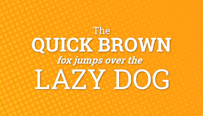
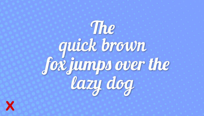
3- Contrasting: This one is definitely my favorite type! I use it all the time and bring something fun to the piece but at the same time focuses the client on the information without distraction. Some people say that is the most difficult way to pair fonts (I really think the conflict is the hard one). The key is to find fonts that work so great together but are so different and find a perfect balance between the length of the text for each font used.
Let’s see a WRONG example about it:
Note that both fonts are very different, the script one has so many curves and laces that are hard to understand a long text, and the other font and different but don’t fit with the script one, there’s so much going on here that your client can be lost in the middle, and again, we do not want that.
So, let’s do it the RIGHT way now:
In this last example I used the same script font from the wrong example, but this time I applied it in the short text, and to balance so much information I used a clean (but still fun) font.
Some secrets to never go wrong with fonts:
- Every design is different, and how it will be applied too, if you are doing a fun t-shirt or social media post you can use more than 3 fonts, just be careful to get the right balance.
- Think that the design is not for you, it’s for your client, so use fonts that are the perfect match for your audience.
- If you have a designer that is doing your pieces, just be careful to check if the fonts are be using the right (but in general trust in their work).
- And if you do not have a designer yet, let’s talk 😉
Concordance, Conflicting, and Contrasting are 3 very unique styles of typefaces, which one, how, and when it will be used is very unique too, and the genre, target, and place will determine this. Stick with the good sense and you will not get wrong, if you feel that the font is not quite right, probably isn’t, so ask for your designer a revision and try to explain what is not good enough.
The font is one of the most important blocks in the design, always remember that. If you need some help with your next design, send me an email 🙂
See ya!

